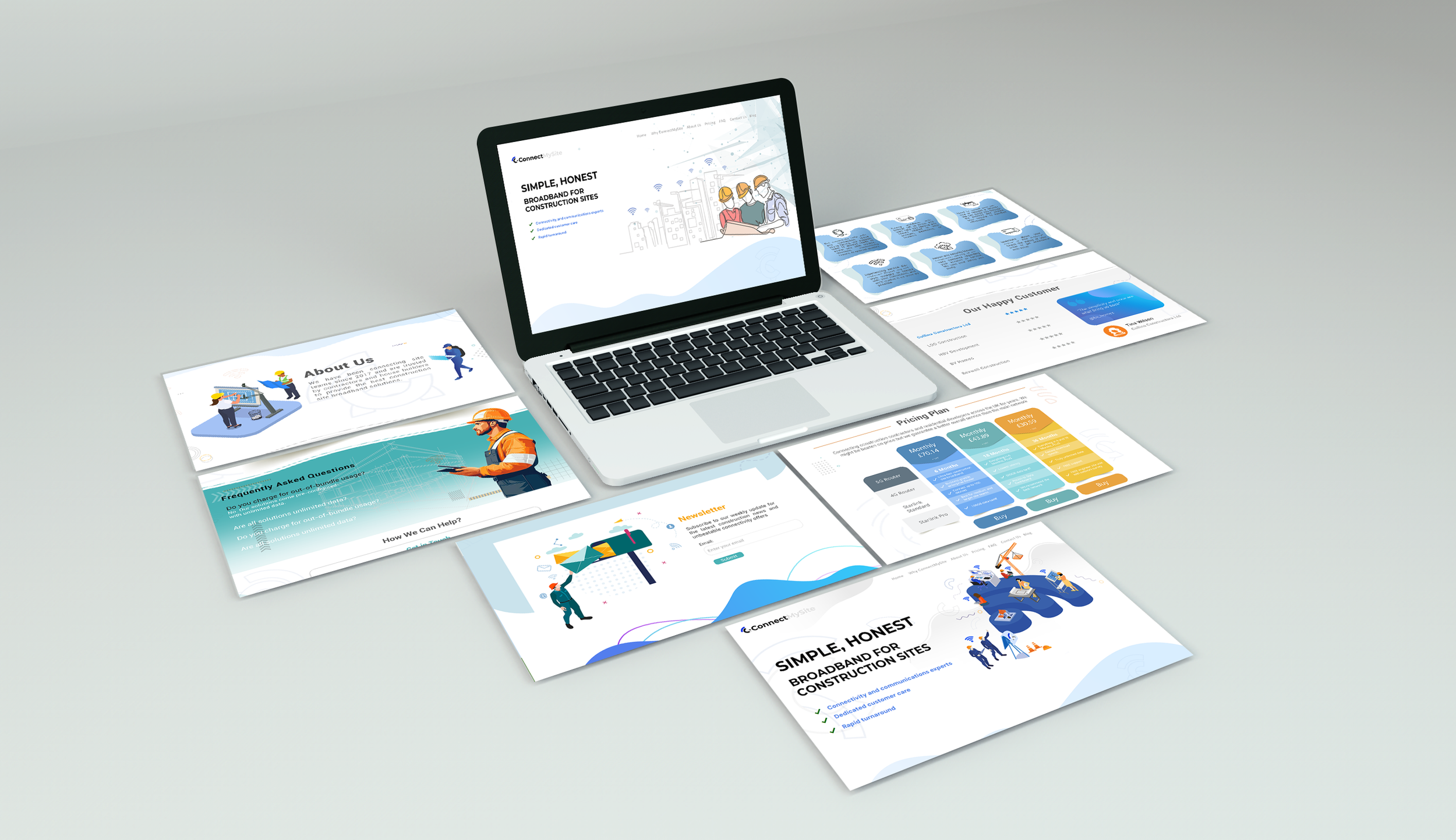
Design Concept & Strategy
The core design idea was based on the concept of
“Fast, stable and transparent connectivity without complexity.”
To support this idea, I focused on:
Clear sectioning and structured layouts
Minimal but meaningful illustrations related to construction and connectivity
Consistent spacing and card-based UI for better readability
Strong headlines paired with short supporting text
Visual & UI Decisions
Color Palette
Blue and green tones were selected to communicate trust, stability, technology, and reliability.
Typography
Clean, modern, and highly readable typography was used to ensure clarity across all devices and screen sizes.
Layout & Components
Large hero section with a clear value proposition
Icon-based feature highlights
Card-style pricing plans for easy comparison
Testimonials to increase credibility
Strong and visible call-to-action buttons
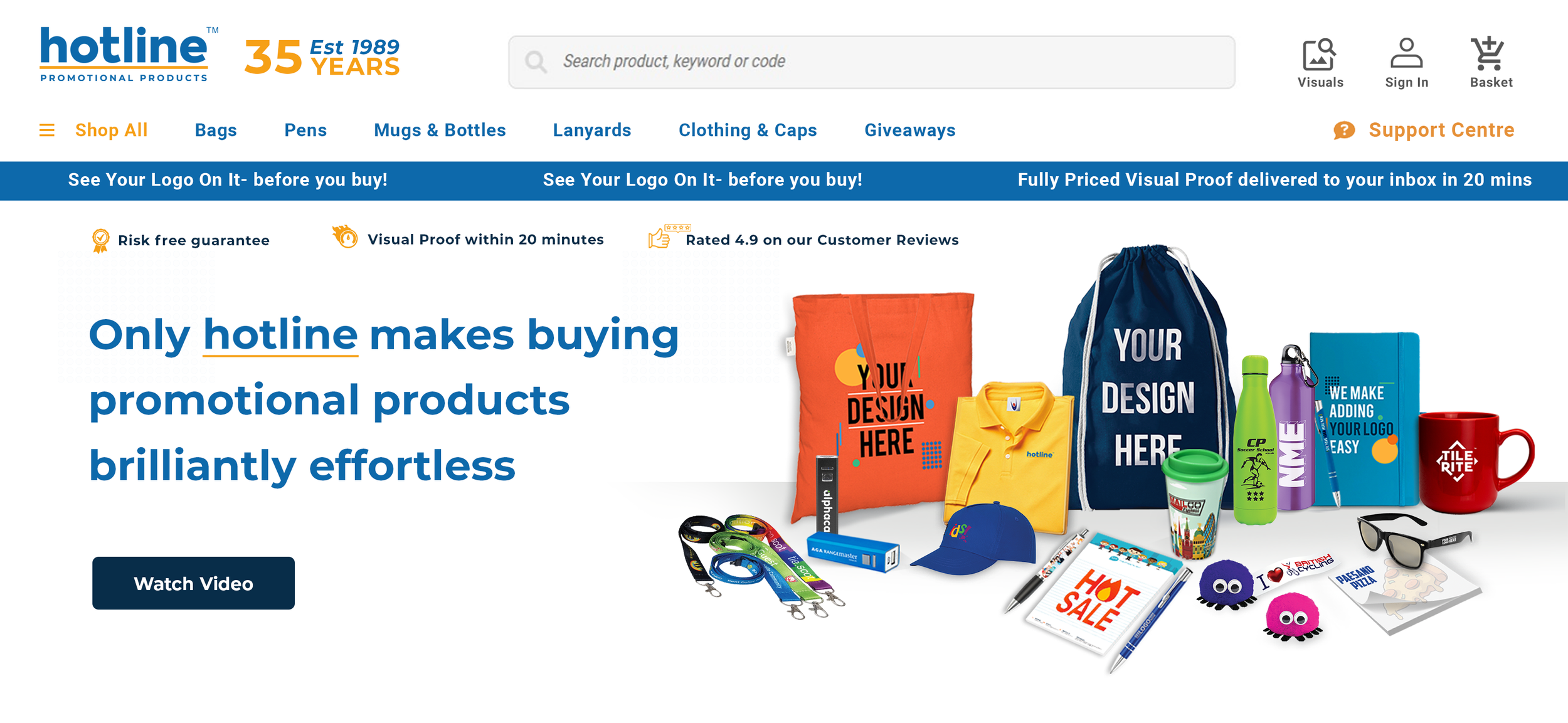
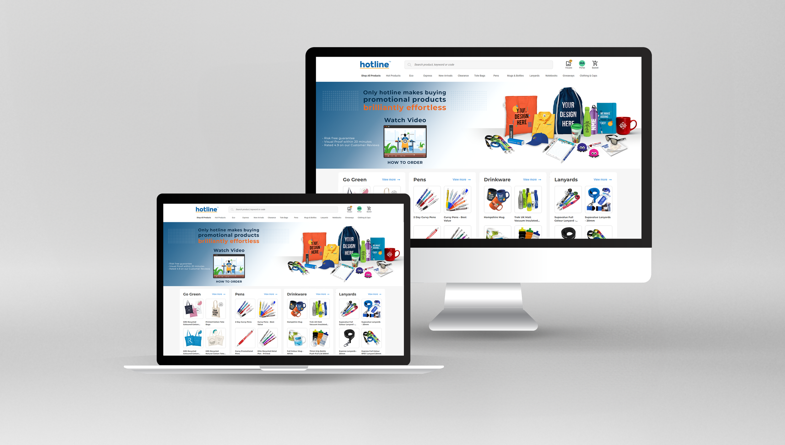
Hotline Promotional Products
End-to-End Brand & UI/UX Design
vibrant and modern website banner that perfectly balances the brand’s long-standing heritage with their most popular, high-demand products.
The challenge was to reflect Hotline’s 35 years of expertise and affordability, while visually emphasizing their best-selling products and fast, customer-friendly service (visual proofs within 20 minutes). To meet this, I crafted a clean, bold, and engaging visual layout that highlights key messages like “Best Price Ever” and “Low Prices”, blending the brand’s classic blue and orange palette for instant recognition and impact.
This design solution demonstrates my ability to translate complex brand values into clear, compelling visuals that enhance customer trust and boost product appeal — a crucial skill for product designers aiming to deliver end-to-end design solutions that resonate in competitive markets.
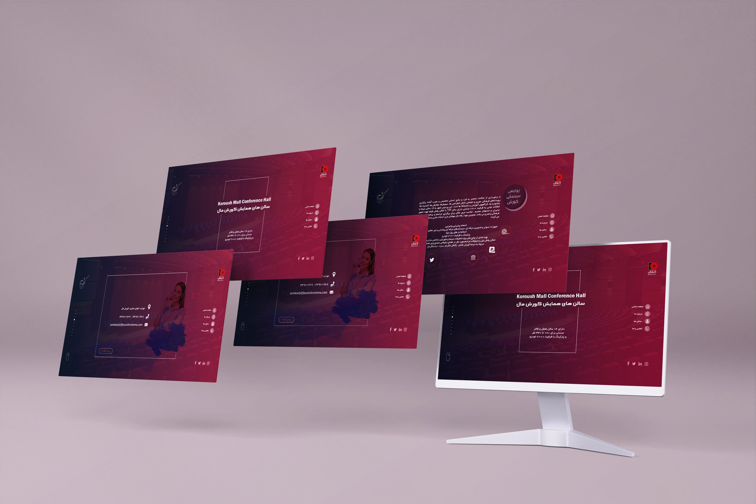
Designing a website for Koroush Mall Conference Hall which is a part of Koroush Mall Complex, one of the best shopping malls in Tehran which has high-quality cinemas. There are several food courts, cafes, playgrounds, bookstore,...
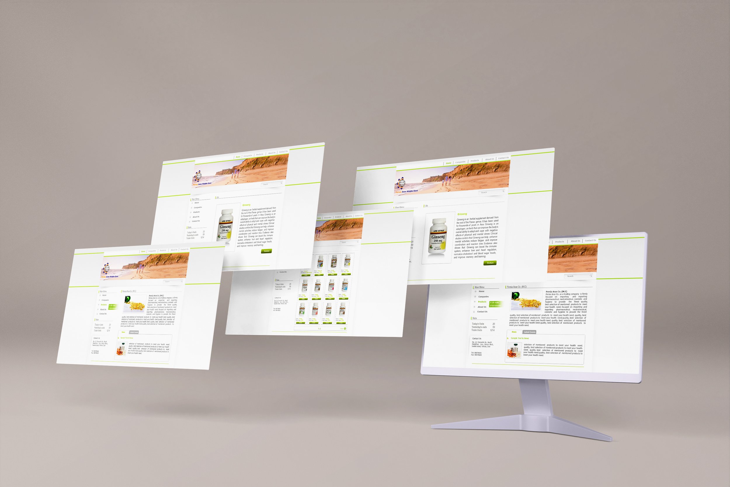
Designing a website for Persia Aras Middle East Company which is a trading company focusing on importing and exporting the pharmaticular products in 2014.
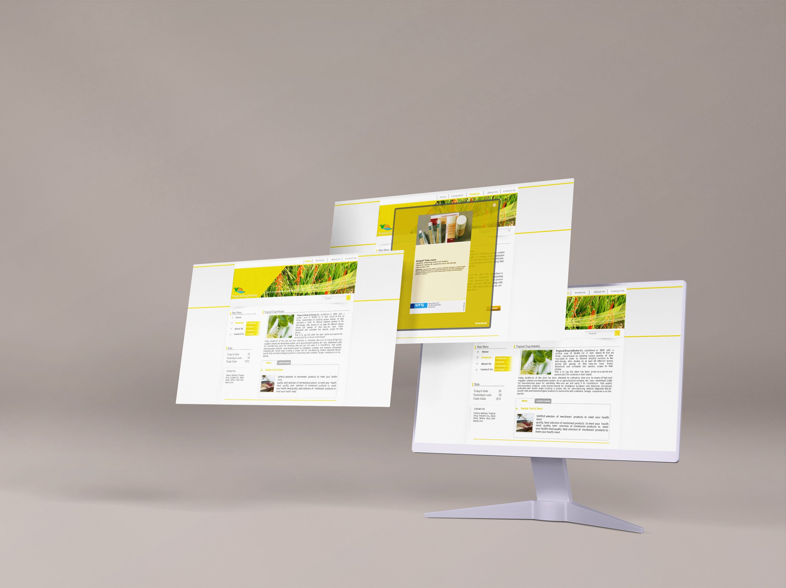
Designing a website for Tropical Company which is a trading company focusing on importing and exporting the pharmaticular products in 2014.
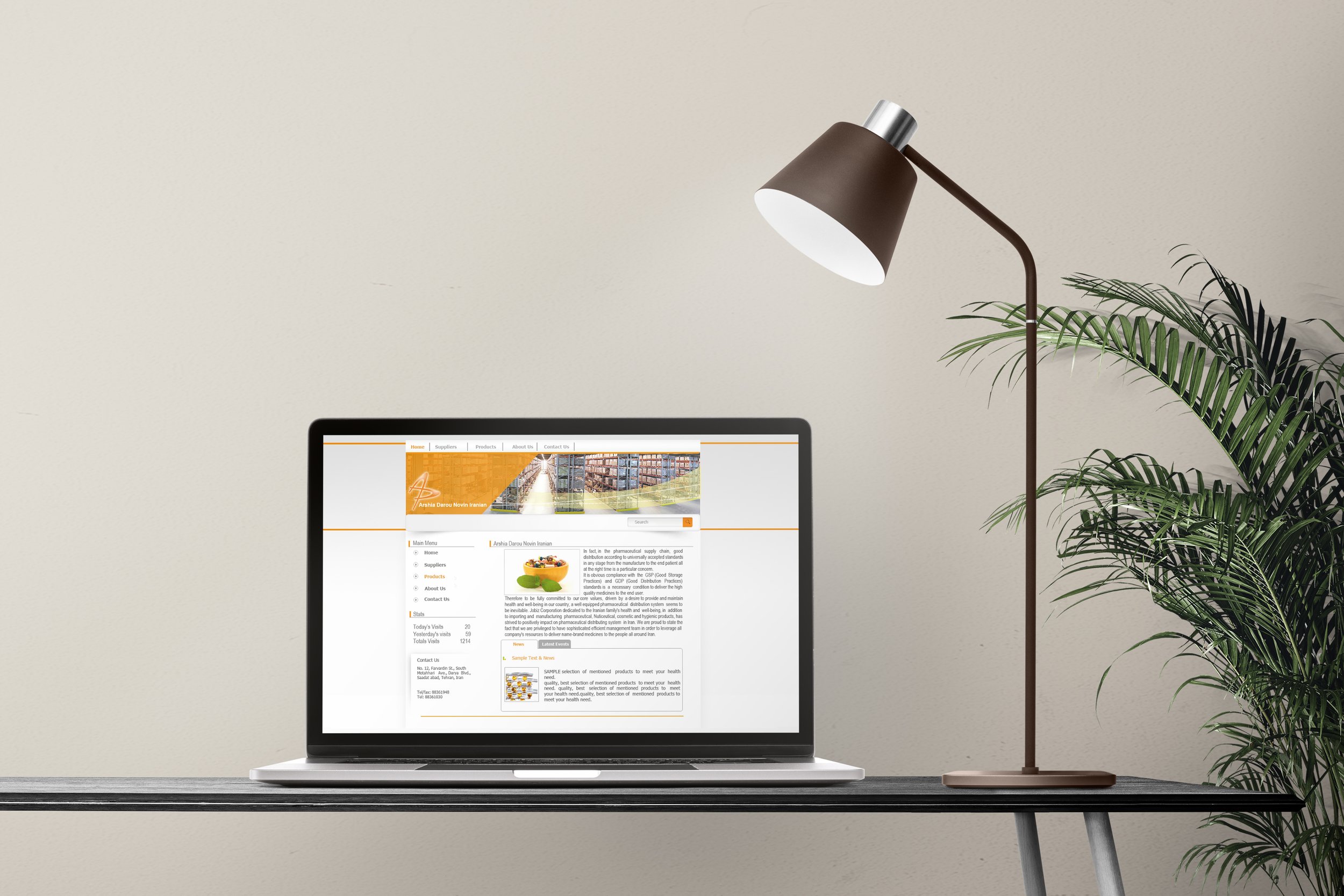
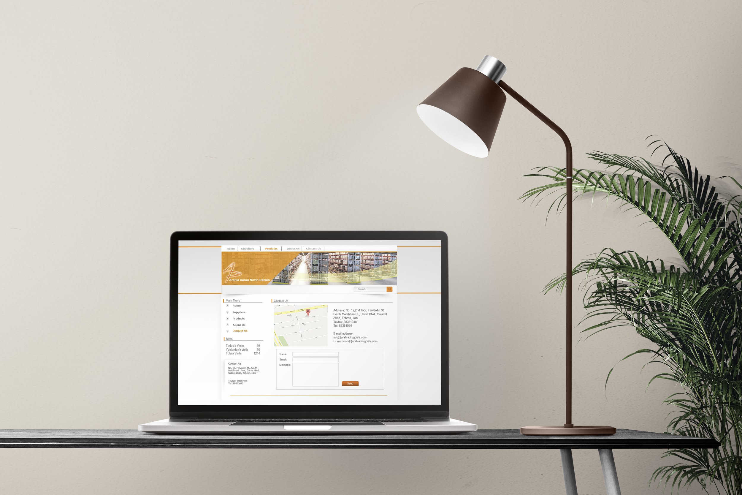
Designing a website for Arshia Novin Iranian Company which is a trading company focusing on importing and exporting the pharmaticular products in 2014.